Museums can feel opaque and intimidating to patrons. How can a digital experience help bring transparency and build a relationship between an arts institution and its visitors?
THE PROJECT
Create an art history app for a museum that encourages users to visit and patronize the institution by making the collection and the space more accessible
THE SOLUTION
An app that allows users to create a curated visit by choosing how much time they have for the visit and what theme they're interested in (including a "greatest hits" option). The app then generates a visit package, which includes a marked-up map and write-ups about the pieces. This gives users their own pocket guide to the visit, encouraging them to see the pieces they came to see and learn more about the art they're looking at.
The app stores these visits in their profile to build confidence and encourage repeat visits. It also allows users to save their favorite pieces and opt into a daily art message that would feature a "piece of the day" with a blurb about why that piece was chosen.
ROLE
Lead UX Designer, Visual Designer, UX Researcher, Content Designer & Strategist
SOFTWARE
Figma, Photoshop
Product Preview
Initial User Research
18 POTENTIAL USERS SURVEYED | 28–75 age range
"We will go to a museum if there's a show we want to see."
"I generally try to look up the most famous pieces ahead of time and slowly try to make my way to them."
"Finding an artist is a challenge. Sometimes their works are spread throughout a museum."
"The size of the write-ups are challenging. It people are crowded too close to them, then you have to wait."
User Pain Points: Museums and Art History
ART KNOWLEDGE
Users did not understand the art they were looking at or why the piece was important.
WAYFINDING
Users struggled navigating the space and felt they were missing things they wanted to see.
CROWDS
Crowd flow often dictated what users saw and prevented them from getting to read the corresponding write-ups.
PACING THE VISIT
Users did not want to participate in a tour if their visit was a social outing.
User Persona
Ryan Pampusch lives in a big city and visits museums a handful of times each year, typically after reading about an exhibit that interests him. He typically visits with his wife and friends.
Frustrations
•Crowds can make the write-ups hard to read
•Doesn't like participating in group tours because museum-going is a social activity
•The maps are also confusing–maybe rooms could be named by the famous pieces within to help
NEEDS
•Wants help navigating around crowds and making sure he doesn't miss what he is supposed to see during his visit
•Would like the write-ups to be more directly accessible
Competitive Audit
THE MET and THE ART INSTITUTE OF CHICAGO are both large museums that have much of their collection posted online. The museums offers directions for short tours on their sites, but the options are a bit hard to find. Users can purchase tickets, shop, and become members online. AIC has its own app that seems to only work once you're within the walls of the museum, but the MET does not have an app. There is not a way for users to save pieces with either institution's digital offerings.
DAILY ART and WIKIART are slightly different product offerings, as they are not affiliated with an actual museum or gallery. While both offer "piece of the day" features and allow users to save pieces they'd like to track, WikiArt is user-generated and Daily Art is written and curated by art history experts.
Insights & Opportunities
•Can an app help develop more of a relationship between the user and the museum, and can that encourage users to visit more often?
•How can the app help users feel confident that they will have a successful visit to the space?
•How can an app make a museum's collection less opaque to potential visitors?
Features to Incorporate
1. Allow users to create profiles within the app, wherein they can save pieces they like
2. Offer a "piece of the day" feature as a way to gets users more familiar with the collection, encourage app use, and slightly gamify the museum experience
3. Allow users to create semi-custom visit experiences by offering them several pre-set visit themes, shaped by in-house curatorial expertise
4. Put more curatorial information in users' hands, by delivering it straight to their phones, to bypass crowd issues
Main User Flow
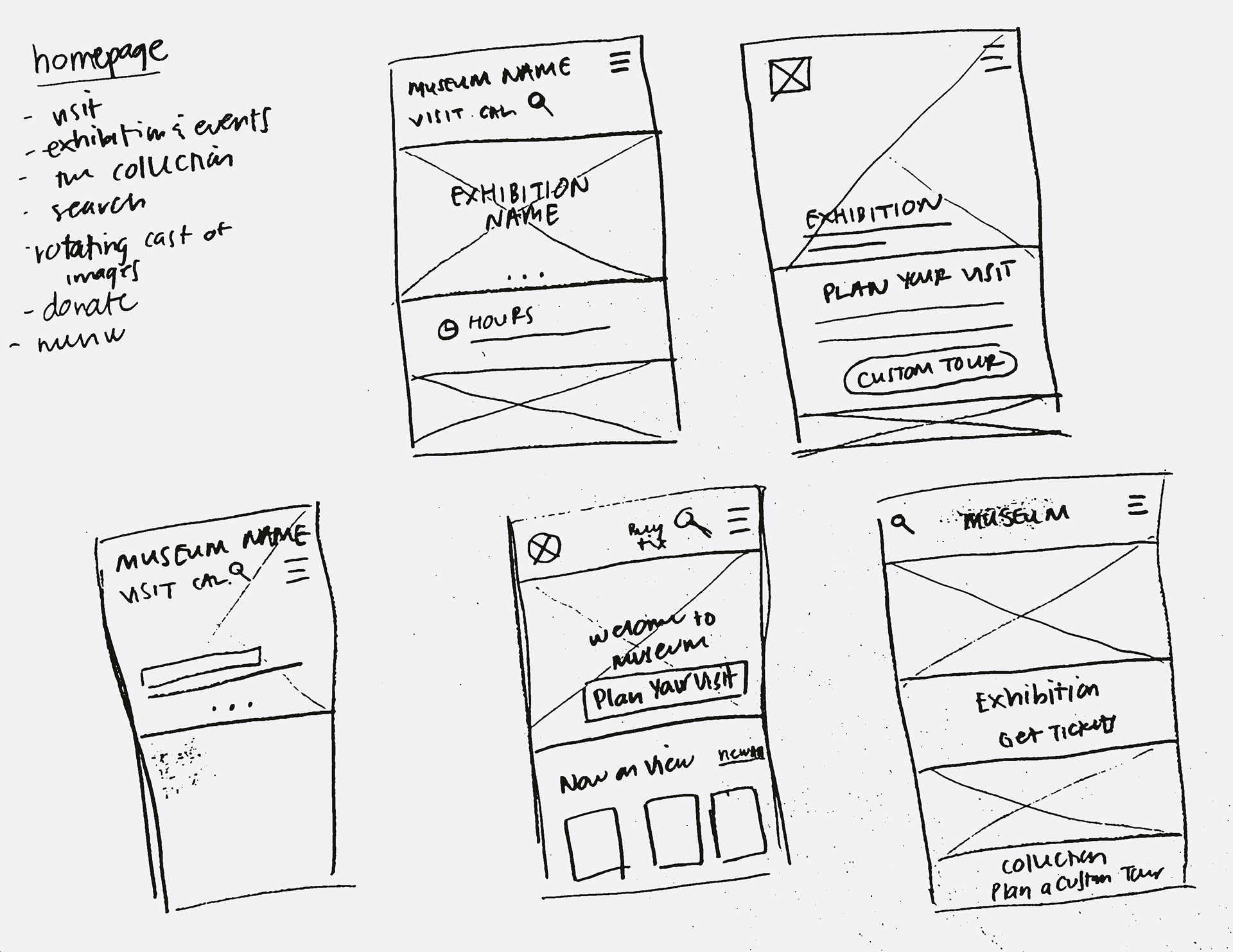
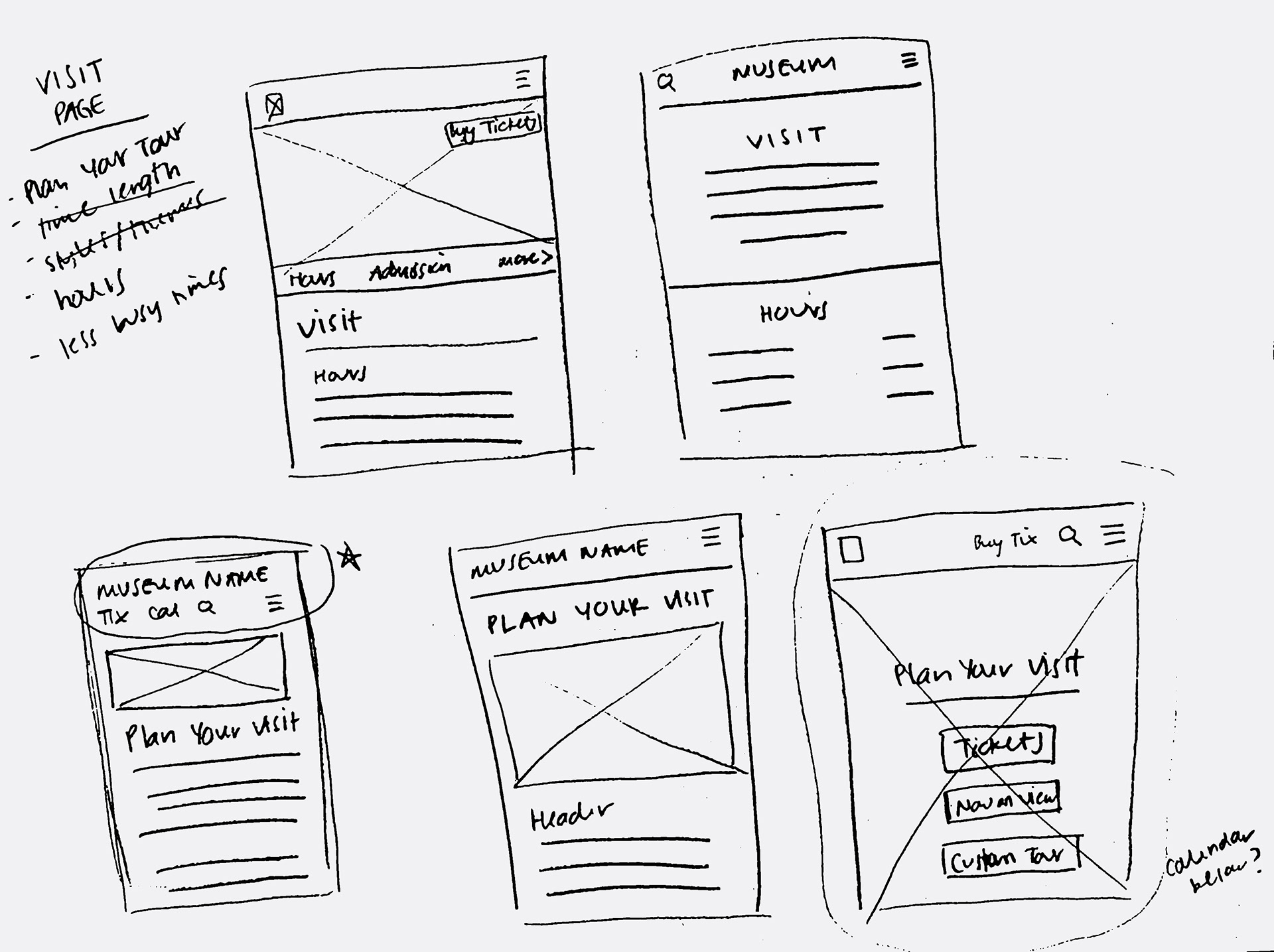
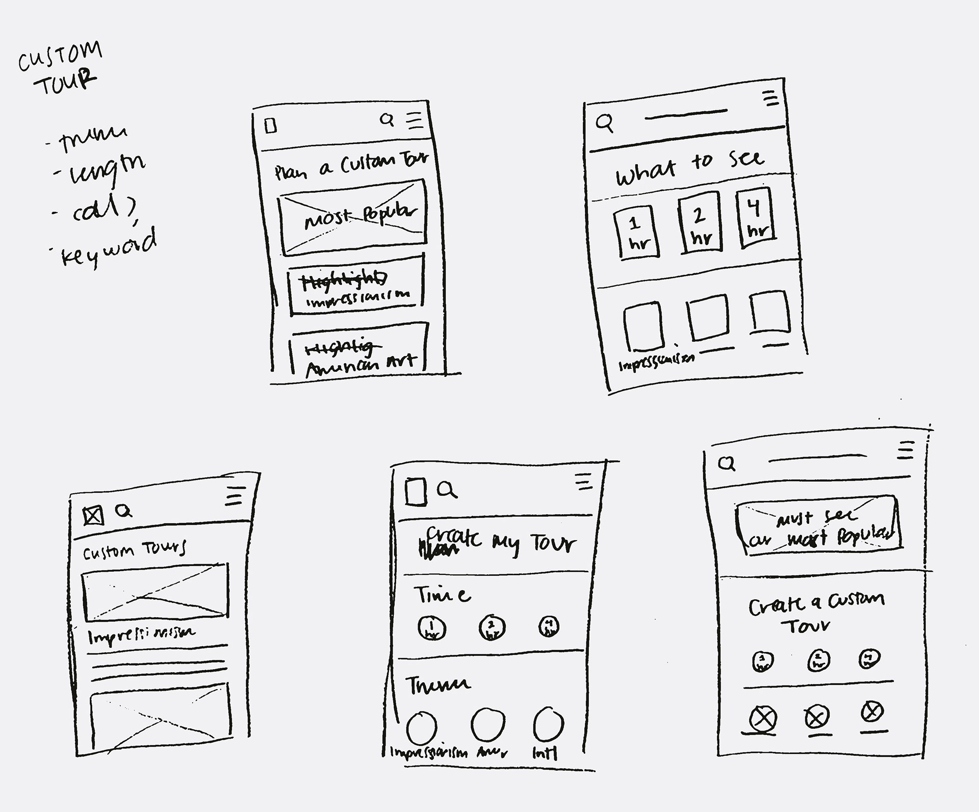
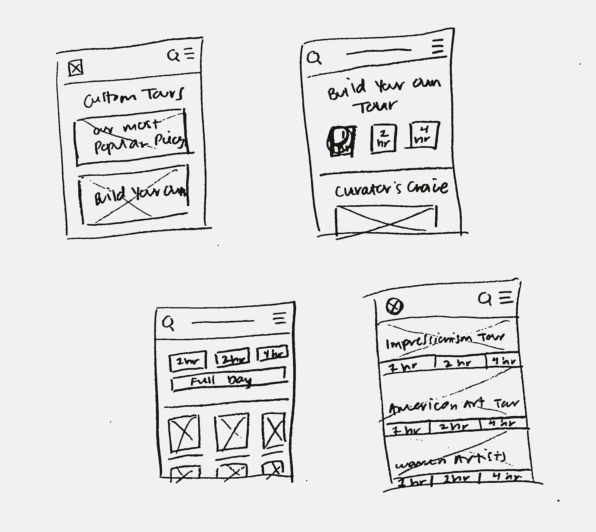
Paper Wireframes


Digital Wireframes
Low Fidelity Prototype
A low fidelity prototype was created from the digital wireframes. I also started to build out a profile section, ticket-buying function, search pages, and exhibition pages.
Usability Study 1
Five potential users were given the low fidelity prototype to test. They were asked to create a custom visit. The main insights gained from the usability study were:
1. Make the visit creation function more clear on the homepage.
2. The term “tour” can be offputting for users who want to be able to find their own way.
3. The term "custom" was also misleading to users since the visit themes were preset.
4. Users were most interested in the "greatest hits" visit option.
High Fidelity Prototype
For the high fidelity prototype, I set the colors and type for the app and swapped in relevant high res images. The largest changes at this point were changing the language surrounding the visit creation function (as it is not a commonly offered product with which users are familiar). I also worked to prioritize Plan Your Visit on the homepage, though this was more effectively changed after the second usability study.
Usability Study 2
Five potential users were given the updated high fidelity prototype to test. These users were once again asked to create a custom visit, this time with updated and clarified language surrounding the visit creation function. The main insights gained from the usability study were:
1. Combine "greatest hits" visit function with preset themes. Users did not understand why they should be different paths within the flow.
2. Adjust placement and treatment of Plan Your Visit on the homepage.
3. Redesign Plan Your Visit page to prioritize the create-a-visit function, and then also include links to other functions users might be looking for.
4. Add a bottom navbar with profile, collection, and today’s events.
5. Add more back functions for additional pages outside main flow.
Visual Design
I chose gold for my main accent color, as a nod to the rich history of the museum's collection. To ensure the design did not look too stuffy or out-of-touch, I used modern sans serif fonts, which were also clean and easy to read. The use of gray as the main neutral color kept the design from looking too precious.
Next Steps
•Incorporate social aspects by allowing users to follow friends, see what pieces their friends like/recommend, and share visit packages
•Incorporate keyword tagging to allow for even more customized visit creation
•Allow app to recommend new pieces/visits to users based on pieces they've saved and visits they've created
•Make pieces in the museum collection scannable through the app, delivering write-ups to users' phones as they make their way through the museum
•Connect to gift shop to make saved and scanned pieces easily shoppable through the app


