How can a cooking school earn users' trust and help home cooks build confidence in the kitchen?
THE PROJECT
Create a responsive shopping experience for a cooking school
THE SOLUTION
The initial prompt asked for a shopping experience, but I found through user research that users wanted to build confidence in the kitchen through improving technique and also having the right tools and ingredients. Though users differed on their approach to cooking throughout their week, most were looking for a reliable way to make delicious meals and feel good about what they were putting on the table. Users were looking for recipes to add to their rotation, chances to improve their cooking techniques or their dinner party presentations, and a single source from which to build confidence in their home cooking.
ROLE
Lead UX Designer, Visual Designer, UX Researcher, Content Designer & Strategist
SOFTWARE
Adobe XD, Photoshop
Product Preview
Initial User Research
13 users surveyed | 28–75 age range
"Yes, I plan meals ahead of time. Choose what to cook based on balance of tried and true favorites and some new recipes."
"I'd take a cooking class if it were a celebrity chef or cook teaching."
"Both livestream and pre-recorded are equally interesting. Ideally I could do a live stream, but realistically, a video that I can stop and start and view at my own pace probably works better with my current schedule."
User Pain Points: Meal Time, Meal Planning, & Kitchen Confidence
TRUSTWORTHINESS OF COOKING RESOURCES
Many potential users found meal time to be generally stressful and wanted a trustworthy source for both cooking instruction and stocking their home kitchens. Users found that many blogs can be unreliable in terms of quality and would pay for a source if it meant the food was reliably of high enough quality.
COOKING STYLE
Potential users fell into a pattern of looking for different kinds of meals: meal planning for the week, recipe-based for weeknight cooking, help learning how to improvise based on what they have, and the opportunity to create a multi-course dinner party meal.
SOCIAL COOKING EXPERIENCE
Some users did indicate that they would be interested in a livestream kind of class where there is more interaction, both with the instructor and with others also taking the class.
User Persona
Kendal Curtice is a busy working mom, who has always loved to cook. She used to host a lot of dinner parties and cook with friends, but now—as a mother of two small children—she often cooks solo and on a tight timeline to get a family-friendly dinner on the table during the week.
Frustrations
•Dinner time has become a source of stress, with two small children to feed every night
•A resource is needed for reliable cooking content so that the cooking is not a waste of time, effort, or money
NEEDS
•She has not taken a cooking class but she does cook most nights. The site would need to fit into her tight schedule during the week.
•A source for tried and true recipes and meal ideas
Competitive Audit
MILK STREET and AMERICA'S TEST KITCHEN are both sites with cooking classes, shopping experiences, and some free recipes offered up as content marketing. The classes and recipes are largely part of a membership offering. The classes are offered by a very wide-ranging group of chefs and cooks, and are not structured within a regular schedule of offerings.
NYT Cooking, FOOD52, and THE KITCHN are more well-known among the potential users surveyed. NYT Cooking is largely understood to be a reliable source for recipes, and many potential users were subscribers, but the site does not offer much in the way of video instruction and does not have a kitchen/cooking shop product arm to its content. Food52 has recently added a regular rotation of cooking videos as its expanded its offerings. But the site feels very crowd-sourced in terms of its recipe offerings and the shop items are not tied into the cooking videos. The Kitchn has recently revamped its digital presence. The site does have some videos, but it is not emphasized as an offering. They have a "cooking tips" section and some shopping guides, but do not have a shop section. The site also features adjacent editorial content about grocery shopping and kitchen design.
Sur La Table is more of a kitchen shop that also has classes, both in-person and online. The shop has a large offering of products, and is less curated for users. The online classes are priced per household, and tend to feature themed, coursed meals.
Many potential users also mentioned that blogs have become a frequent recipe source for them, noting though that the recipes can be unreliable and there is typically a lot of editorial content featured on the blog that they don't necessarily read.
Insights & Opportunities
•Can a site provide cooking instruction within a regular structure that helps users get through the week in their home kitchen?
•Can a site provide expertise within every section to give users increased confidence in the product?
•Can a site offer users the chance to track class videos, recipes, and products in a personalized library of saved items?
Features to Incorporate
1. Post classes in a regular schedule on which users can rely
2. Present a stable of well-vetted chefs that offer the classes, recipes, and products
3. Allow users to create a personalized library of items they want to re-visit
Sitemap
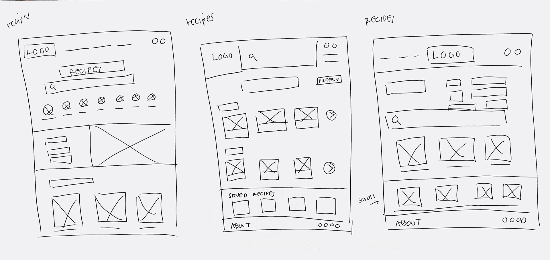
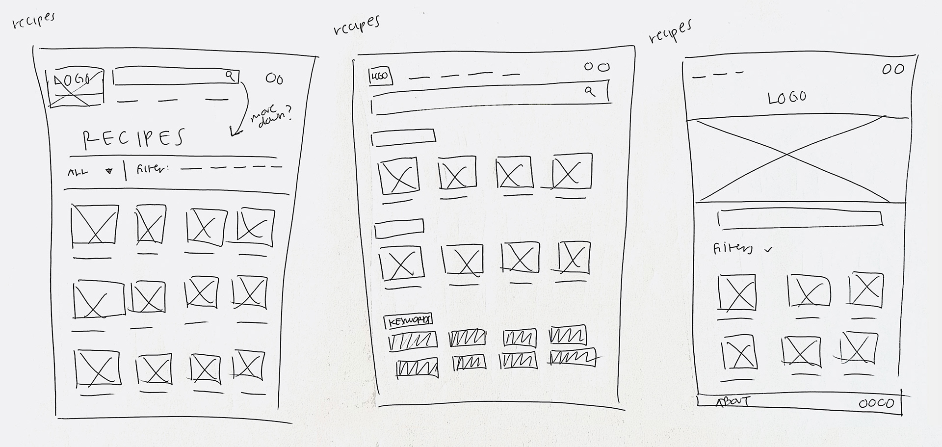
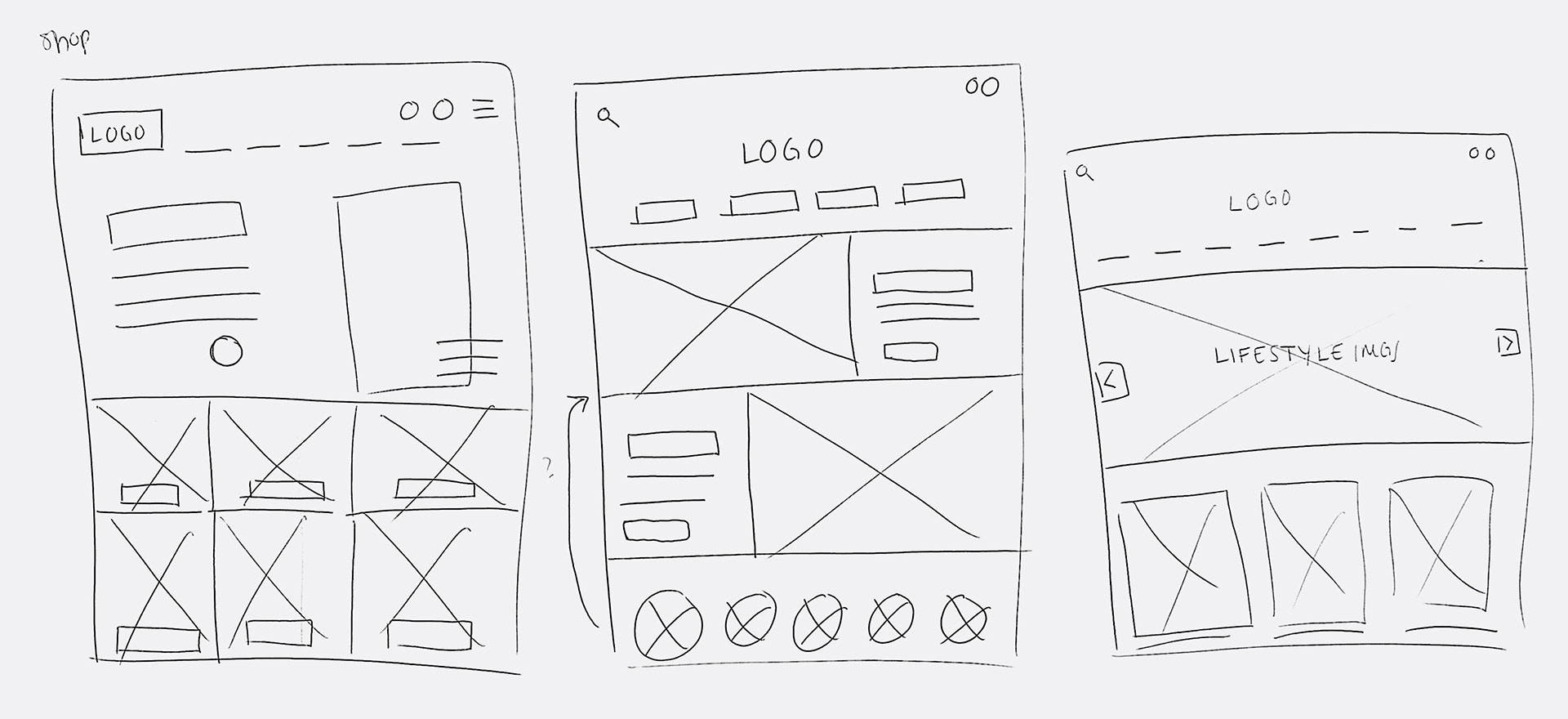
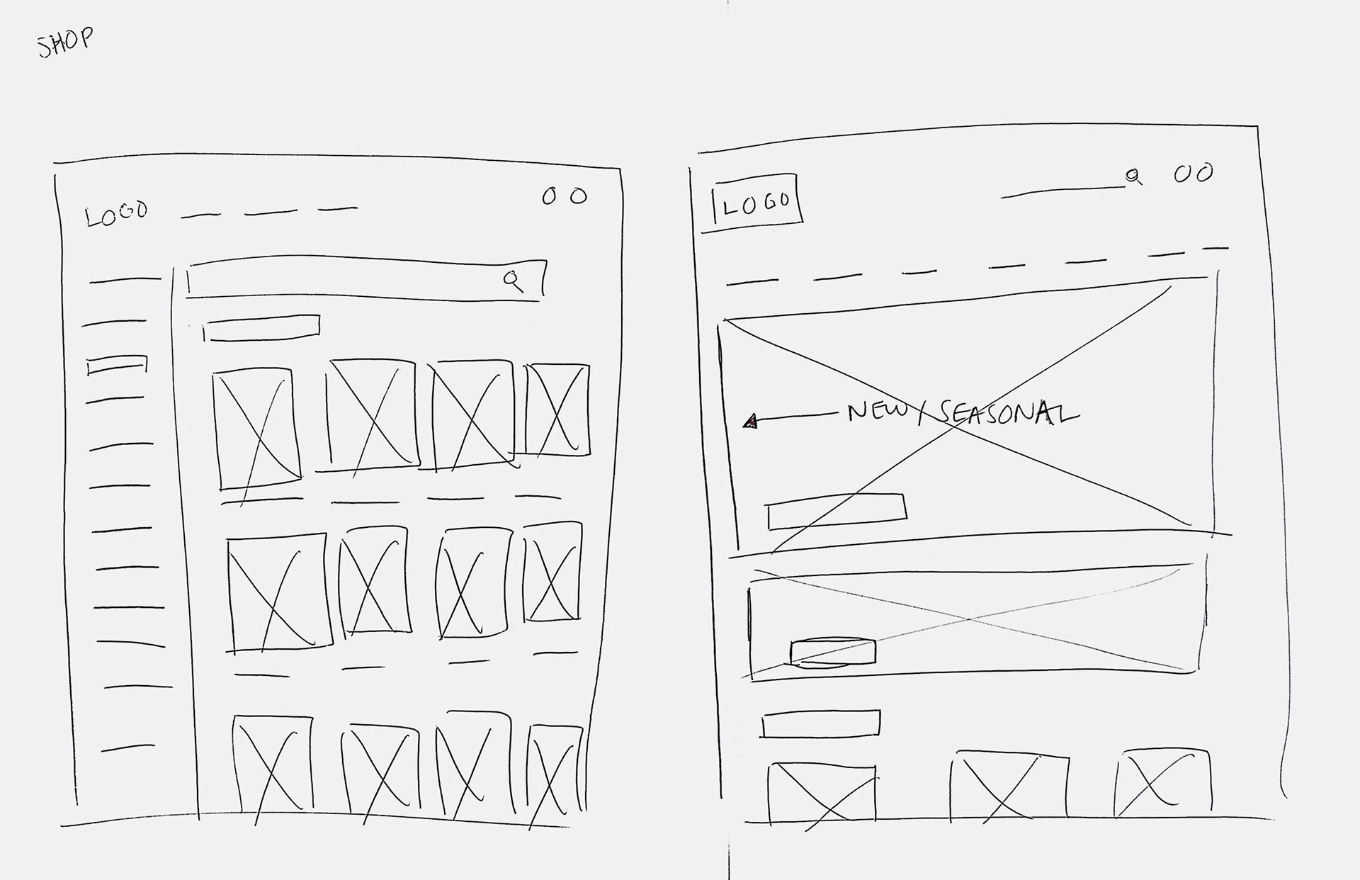
Paper Wireframes


Refined Paper Wireframes
Through paper wireframes, I iterated on the design of the homepage, the school section home, the recipe section home, the shop section page, and the user/account section page.
I wanted to make sure the content was easily accessible, but also wanted to communicate expertise; I did not want the site to read like it was crowd-sourced. Keeping this in mind, I landed on a strong graphical approach to stacking the elements, which would also translate well to mobile. The horizontal bars could also get interrupted by circle and square frames to help keep the eye moving and serve the variety of the content.
Digital Wireframes
Digital wireframes for mobile
Low Fidelity Prototype
A low fidelity prototype was created from the digital wireframes. I focused on the main user flow of allowing a user to purchase a class, and then also added a recipe section, shop section, and account page.
Usability Study 1
Five potential users were given the low fidelity prototype to test. They were asked to purchase a ticket to a class. The main insights gained from the usability study were:
1. Users found the language surrounding the purchase of a class (and class being under the school tab) to be confusing and that needed to be clarified.
2. The takeaway from buying a ticket to a class needed to be clearly defined for users.
3. Users didn't understand why the calendar tab was so important as to get included in the top navigation bar.
4. Users wanted to be able to continue shopping after adding a class to their cart.
High Fidelity Prototype
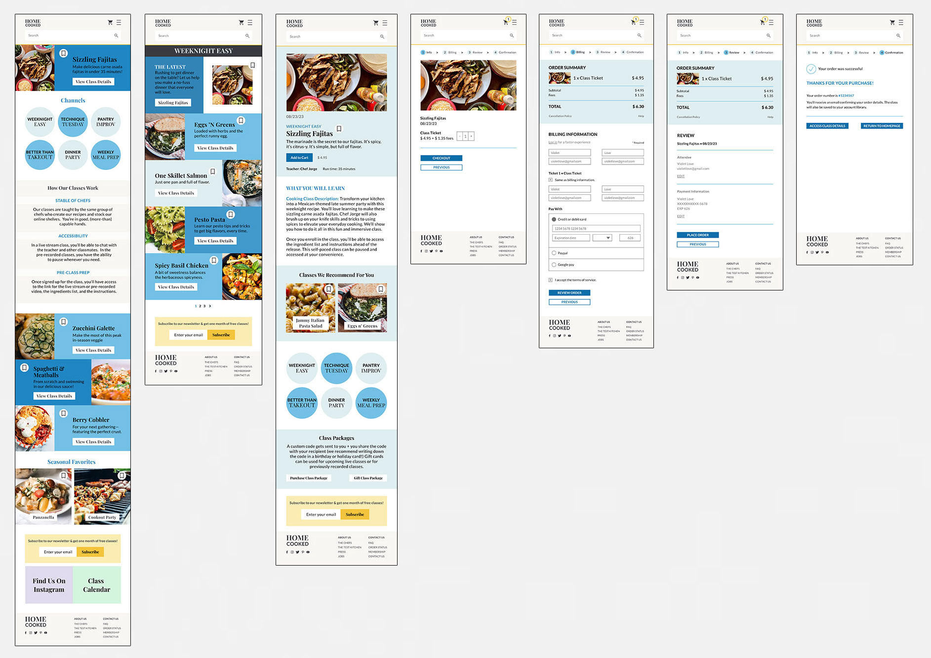
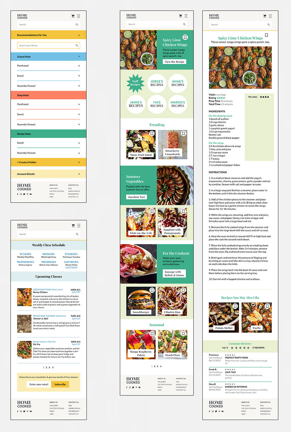
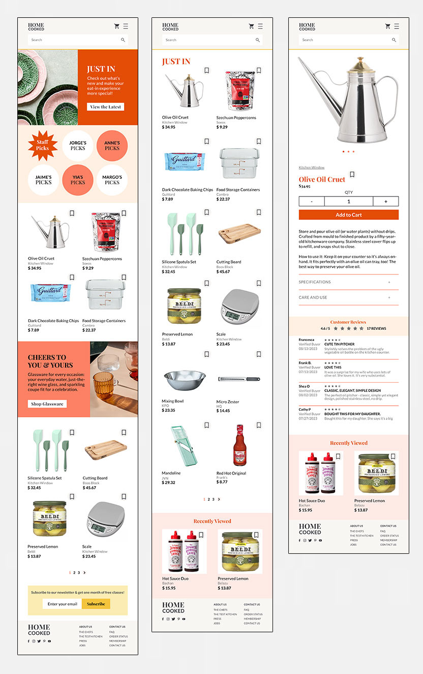
For the high fidelity prototype, I set the colors and type for the app and swapped in relevant high res images. To help visually clarify the sections of the website, I assigned a main color to the school, recipes, and shop sections. The largest changes at this point were changing the navigation bar items to remove the calendar tab, clarifying for users what to expect when they sign up for a class, and adding a checkout process for a shop item.
Usability Study 2
Five potential users were given the updated high fidelity prototype to test. These users were once again asked to purchase a spot in a class and click through some of the other sections to see what might be missing from a user experience. The main insights gained from the usability study were:
1. Add additional screens to the mobile user flow.
2. Refrain from using triangle "play buttons" to indicate video content. This should only get used on top of playable video content.
3. Add bookmark action/icon throughout.
4. Make placement of recipe/class buttons more consistent.
Visual Design
I chose a neutral beige for the main color, complemented by a dark gray and two shades of yellow. For the school section, I applied three shades of blue. For the recipes section, I applied two shades of green. For the shop section, I applied three shades of red. I wanted these strong colors to help differentiate the sections to users.
Next Steps
•Explore a subscription model for class pricing and how that would impact the checkout flow
•Add keywords to product, recipe, and class pages to allow people to search the site that way
•Add filter options to search results
•Include conversion charts for measurements and ingredient substitution guides


