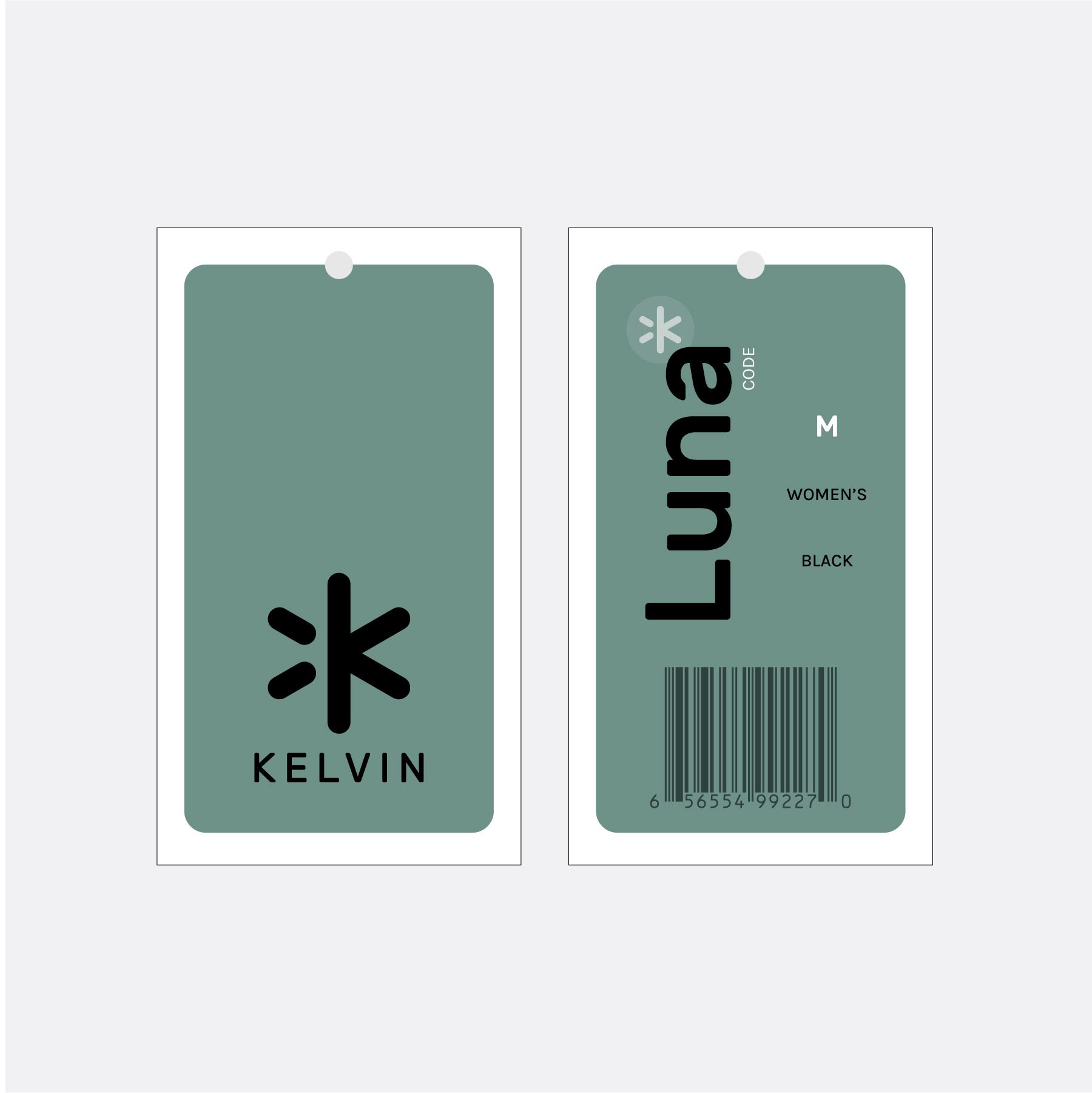
The team at Kelvin Coats was coming out with a new line of products and took this opportunity to re-evaluate its visual identity, as well as its brand narrative. Kelvin makes heated outerwear, and the company wanted to set itself apart from the market with its emphasis on a more fashion-forward version of this tech-powered product.
The team wanted its target audience to associate the following terms with their brand: hygge, modern, simple. The company already had an effective visual icon as part of their logo. As part of my work, I pitched a logo update through a typeface change that would convey the elevated style of the product offerings and de-emphasize the tech aspect. This approach was then rolled out through a new hang tag and interior label design.
Role: Lead Designer & Creative Consultant
Logo Exploration
Original logo
Proposed logo updates
As part of my work with the team, I explored a logo typeface change. The logo already had a great icon, but the typeface looked more tech-forward when the team wanted Kelvin to be associated with lifestyle branding and a more fashion-forward style. I experimented with typefaces that also complemented the rounded caps of the icon. Kelvin ended up choosing the top left version and that typeface was implemented in the design work that followed.
Hang Tag Design Iterations
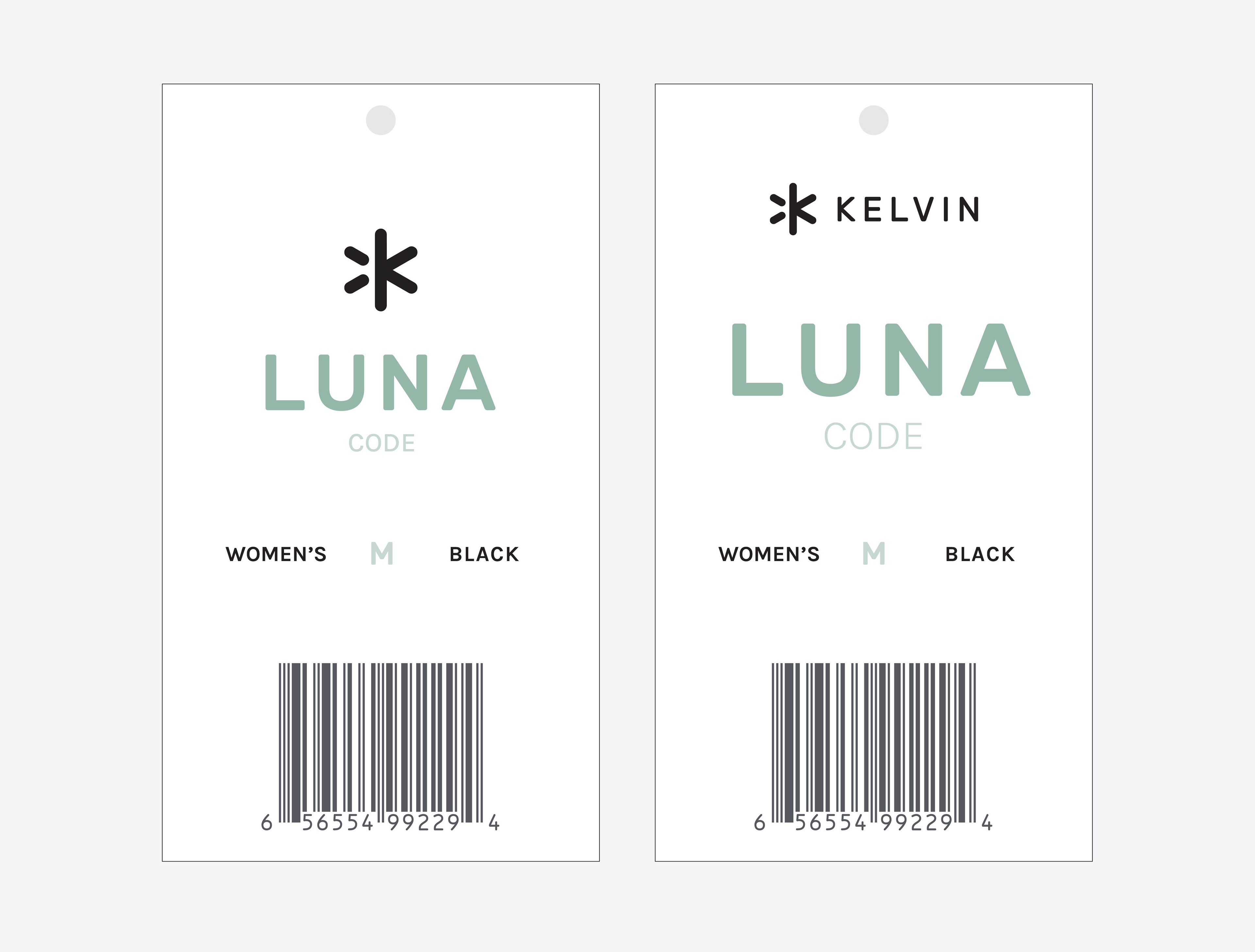
Single-sided design iteration | revamp of previous iteration
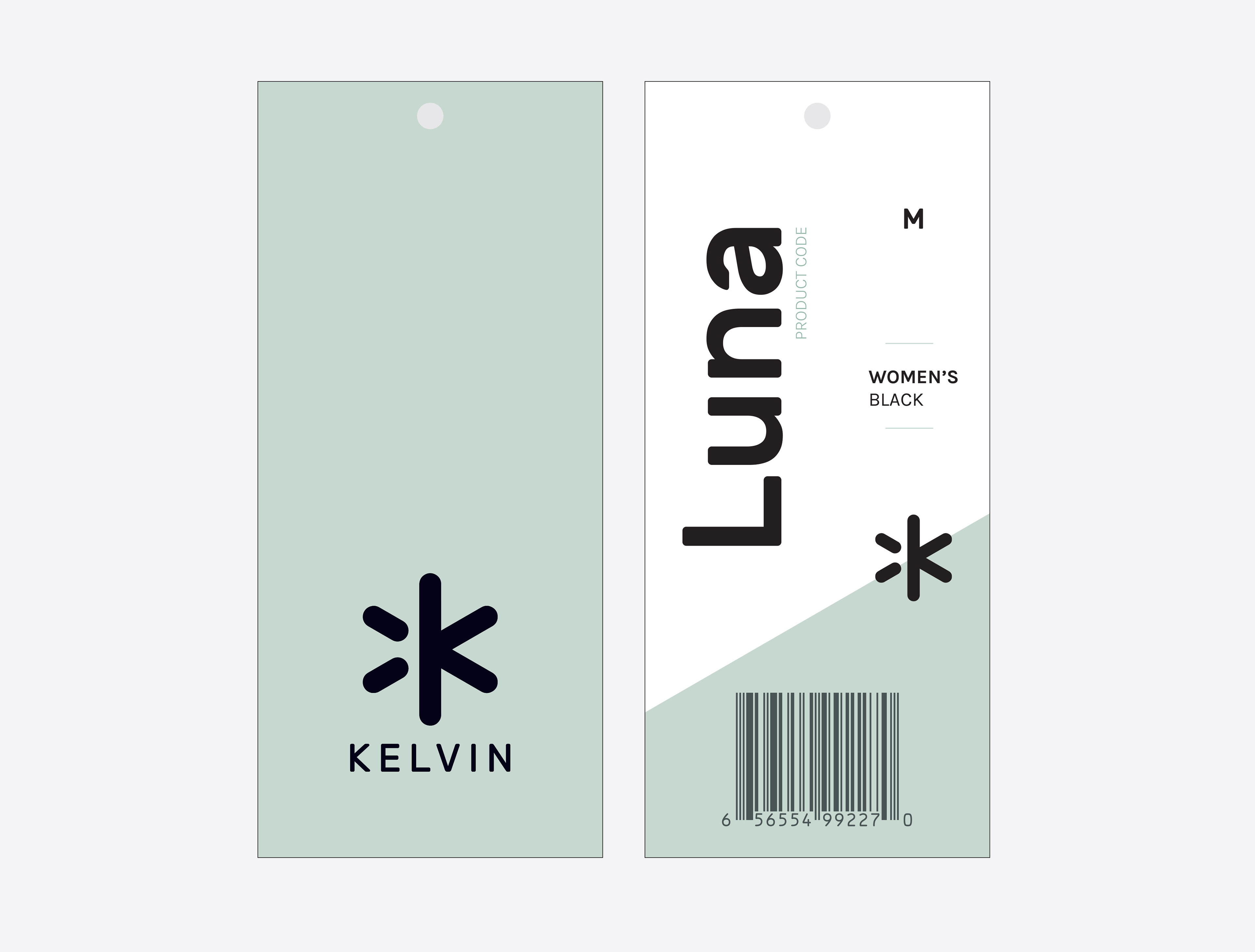
Two-sided design iteration
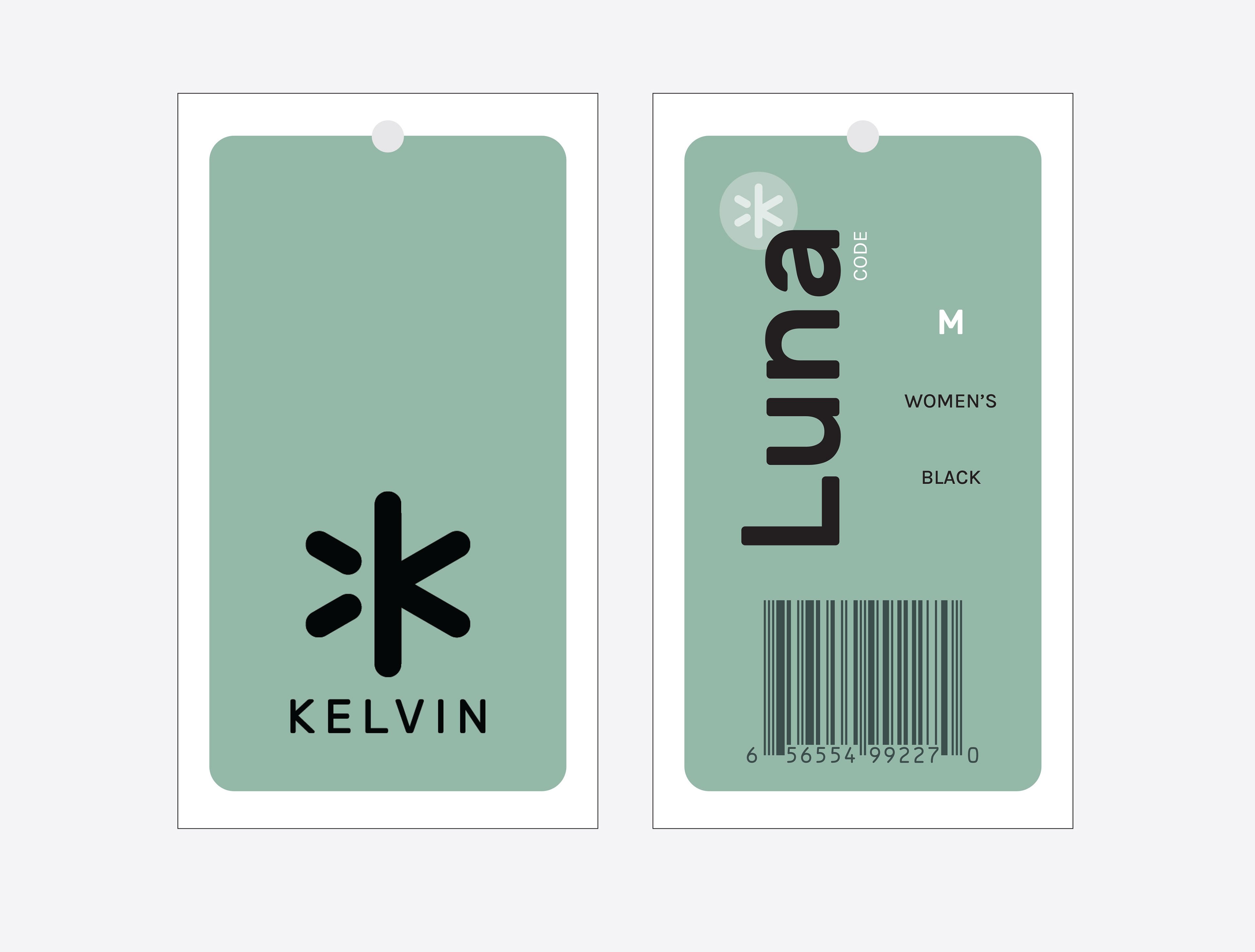
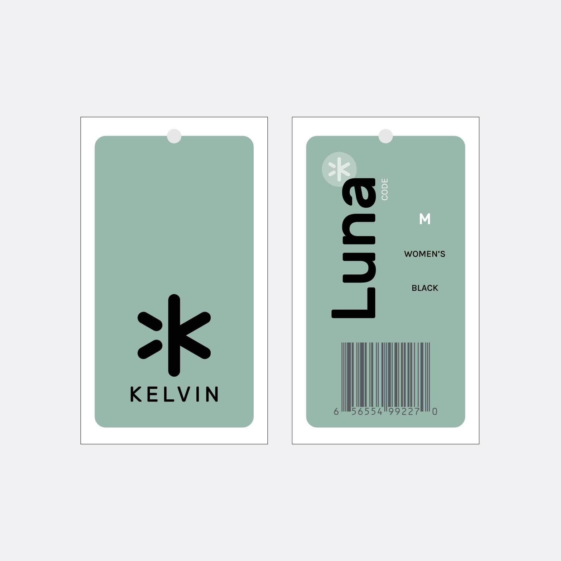
Two-sided design iteration | chosen direction
I created a few initial design options for the hang tags, including one-sided options on solid white that followed the original hang tag design much more closely, with updates made to unify the branding. After evaluating the initial options, the Kelvin team decided on a two-sided option that was more of a departure from the previous batch of hang tags. Though they liked the two-sided version with the angled field of white, they decided to pursue the more simple, two-sided tag with the solid colored background and the rounded corners. At this point, they wanted to see some additional color options before committing to the green direction.
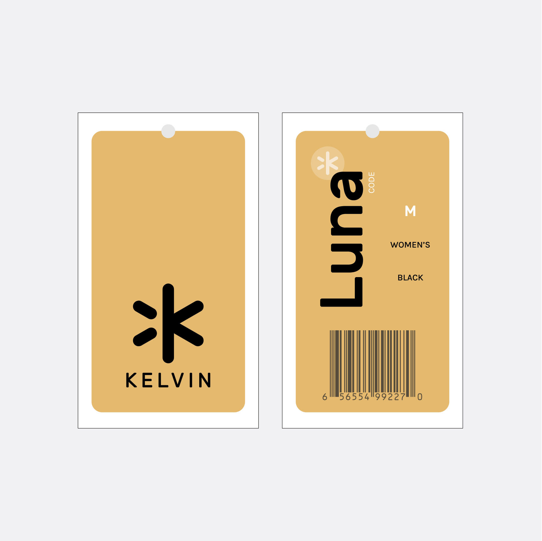
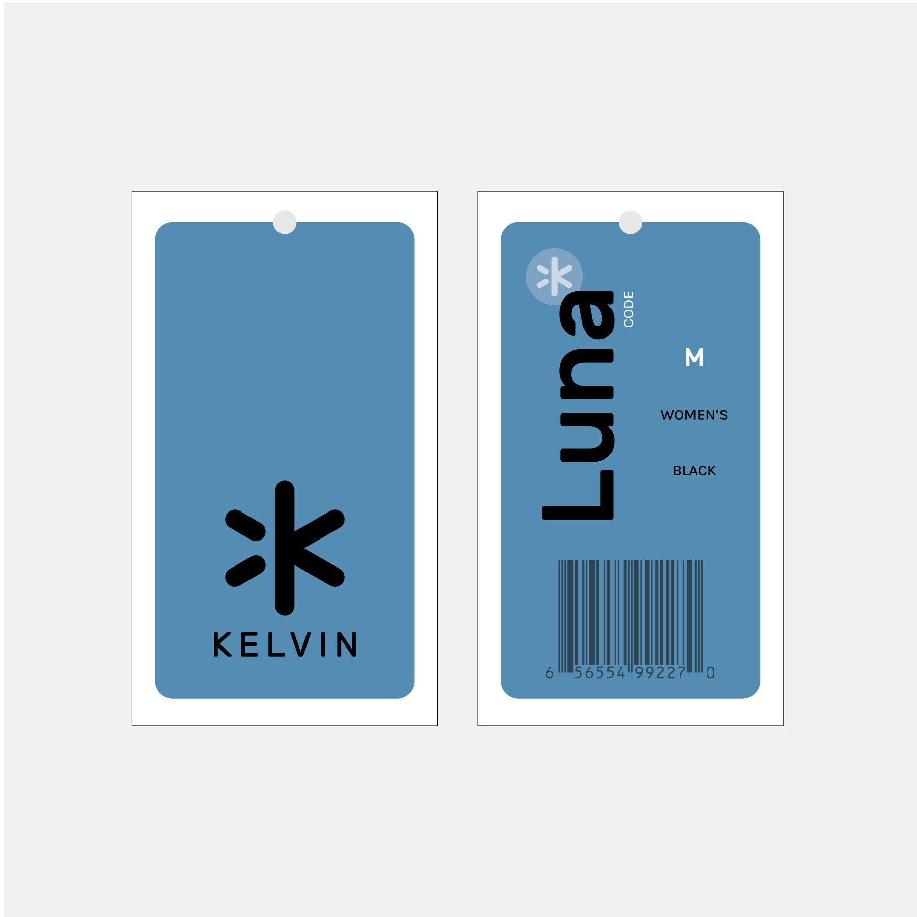
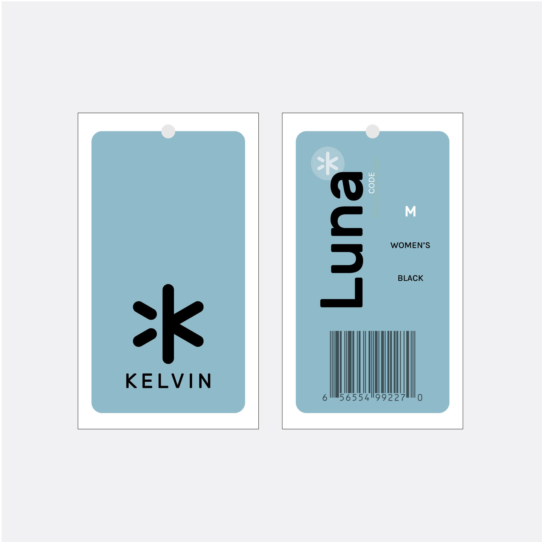
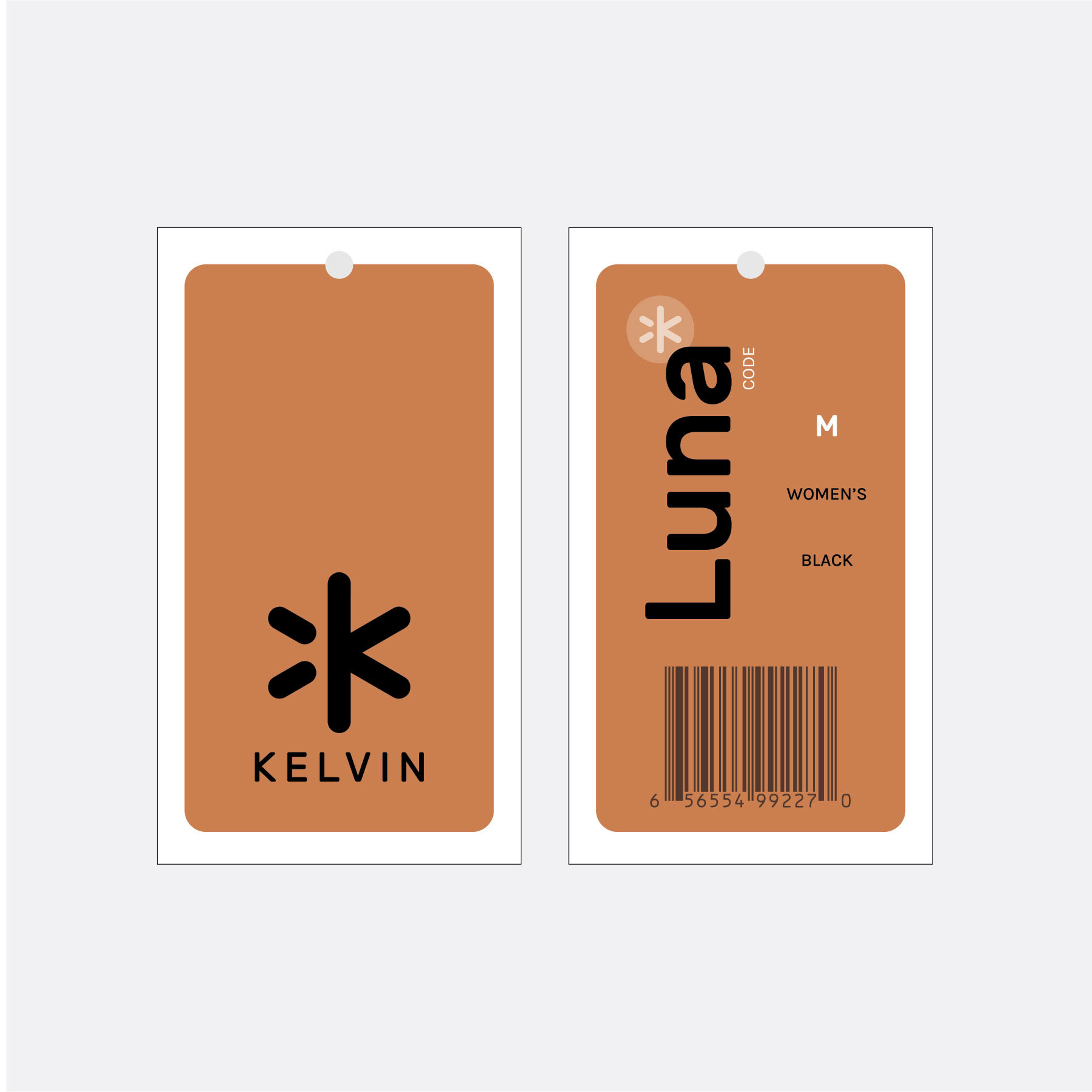
I worked up some additional iterations utilizing a wider color palette, while still keeping the modern Scandinavian feel in mind. I also included a couple of warmer toned options as a nod to the heat tech that powers the products. After reviewing these options, the team decided to go with the original green direction.
